Microinteraction: Adding that Extra Touch to your UX
Details matter in your designs. In today’s digital design landscape, harnessing motion and interactivity in your online experience is important to set you apart from the competition. Whether it’s for a company website, portfolio, or just to challenge yourself, well crafted interactions are the remedy. Luckily with today’s software choices creating this animation witchcraft is easier, smoother, and more witchy than ever before. Let’s begin with the basics and explore helpful strategies for a professional look.
What are Graphical Microinteractions?
AIRD (Attention): In an effort for universal terms while describing “elements” of layouts we will be using Atoms, Molecules, Organisms, Templates, Pages. Please reference Brad Frost’s, fantastic, Atomic Design System for a basic breakdown.
Graphical microinteractions are user initiated actions applied to atoms (icons), molecules (buttons), or organisms (mobile menus) that create and showcase an animated transition of helpful or interesting visual feedback for the user to learn, or just simply enjoy. The animation could show the user where to navigate next, prevent an error, or something related to look and feel, like hitting a LIKE button to create a cloud of hearts around the user’s finger, related to look and feel.
Article FYI: Microinteractions are a part of a larger interactive family that includes non-visual cues and include things like your phone’s vibration notification.
The Structure of Microinteractions
Microinteractions are like bowling, there are rules. You’ll want to follow them to create the most effective interaction with your user. Here are some helpful definitions to get you started.
The Trigger
A user action that begins the animation. These are exactly what you think they are, basic mouse clicks, finger taps, swipes, pinch. Classics are most effective, but find ways to make them unique or maybe surprising. I personally design more conservatively depending on how important the interaction is for the user (i.e. directional or informative interactions). It can be fun to surprise the user with easter eggs. (Here is one of my favorites, most users won’t see it, which makes it a great find.) For a retro taste, I’m a big fan in the Konami Code, a popular Nintendo cheat code (up, up, down, down, left, right, left, right, B, A, Start/Enter ).
The Rules
The governing laws of the interaction. The rules should guide the user into a specific direction.
The Feedback
A verification that the desired interaction has happened or an error has occurred.
Loop / Modes
How a microinteraction is repeated or reused. Don’t overdo it, you don’t want the user to get sicks of having to deal with animations slowing them down.
What is a Successful Microinteraction?
Your microinteractions should add to the overall user experience, not outshine the user’s end goal. They should only be slightly noticeable to your user while helping them to use the website effectively. They should communicate information in an interesting way that catches the user’s attention and then be forgotten. Finally, and most importantly, they make the user experience rewarding. When done correctly, these interactions will add to the strength of your brand and show the user you care.
Let’s Take a Look at Examples

Download button
- A quick animation that informs exactly how far the download has progressed. This helps to prevent human error, like accidentally canceling or leaving the screen.
- The button rules change from download, to cancel, to finally confirm download complete.

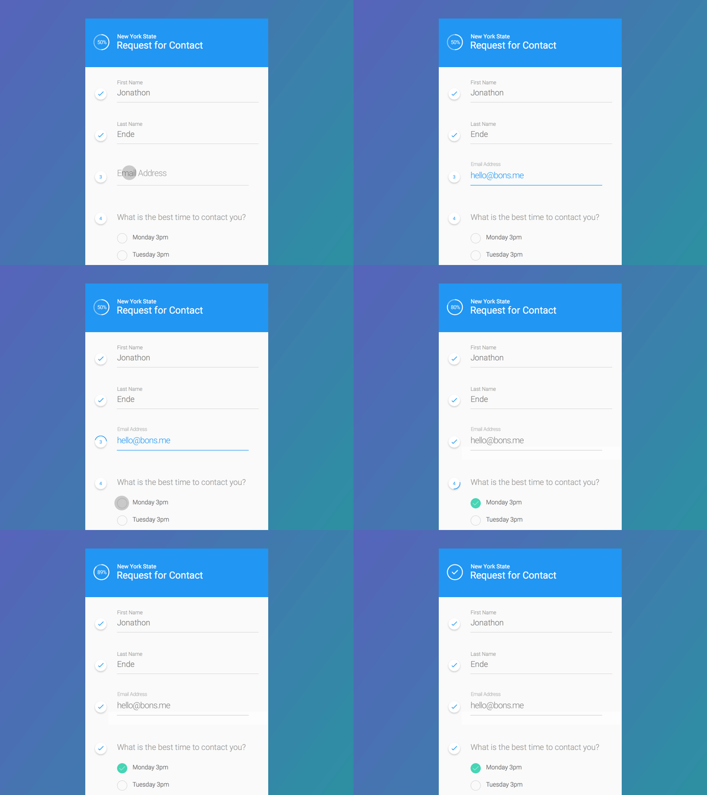
Process Form
- A step by step process to inform the user what fields have been completed.
- Notice the animation does not distract from the form. Remember, these animations have to repeat over and over so hey should almost feel invisible, universally clear, and conspicuous.
In Review
This article is really only touching the surface of microinteractions — dig deeper to find more information online. Generally, the basics for microinteractions are:
-
Keep the user engaged and informed.
-
Simple animations are the best. Motion should be under 0.2 seconds.
-
Animation should be smooth and on-brand.
-
Microinteractions should add to the user’s experience on your site, not distract.
Additional Reading
We’ve really only scratched the surface on the subject. So, I’ve added some helpful links at the bottom of the post for the curious. If you’re ready to go deep, try this book Microinteractions: Designing with Detail | Written by: Dan Saffer. (FYI: I did not have time to read this book myself so I can’t endorse, but it might be a good starting place for you.)
Reading
- Dribbble - Search for microinteractions to see some of the best designer examples of what can be done.
- Microinteractions: Why details matter from Smart Design - This includes a video for a more in depth understanding.
- How you can improve UX with Microinteractions - Detailed microinteractions and how to improve them.
- Digital Arts - Software to get started creating microinteractions
More from Ecommerce...

Your ecommerce platform is the nucleus of your business and choosing the right platform for your website is the essential nutrient for longevity and growth of your business.

We’re kicking off the new year with a fresh approach to help you learn more from us—and about how we can help your business grow.

In the final part of our 2025 planning guide, we’re diving into a crucial practice for any successful ecommerce business: staying dynamic in an ever-changing market.


